Quick update: Briar Press Instagram coverage
The main forum for letterpress discussion, Briar Press, covered my Queer Type project with an interview and Instagram post:
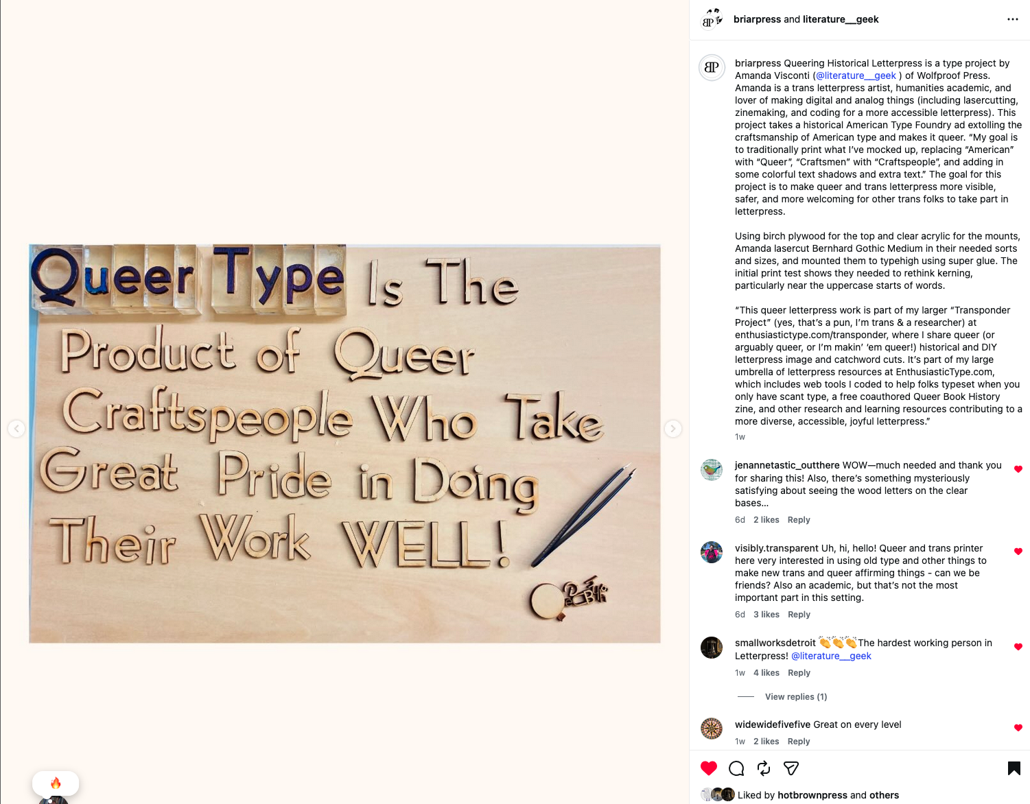
Queering Historical Letterpress is a type project by Amanda Visconti (@literature__geek ) of Wolfproof Press. Amanda is a trans letterpress artist, humanities academic, and lover of making digital and analog things (including lasercutting, zinemaking, and coding for a more accessible letterpress). This project takes a historical American Type Foundry ad extolling the craftsmanship of American type and makes it queer. “My goal is to traditionally print what I’ve mocked up, replacing “American” with “Queer”, “Craftsmen” with “Craftspeople”, and adding in some colorful text shadows and extra text.” The goal for this project is to make queer and trans letterpress more visible, safer, and more welcoming for other trans folks to take part in letterpress.
Using birch plywood for the top and clear acrylic for the mounts, Amanda lasercut Bernhard Gothic Medium in their needed sorts and sizes, and mounted them to typehigh using super glue. The initial print test shows they needed to rethink kerning, particularly near the uppercase starts of words.
“This queer letterpress work is part of my larger “Transponder Project” (yes, that’s a pun, I’m trans & a researcher) at enthusiastictype.com/transponder, where I share queer (or arguably queer, or I’m makin’ ‘em queer!) historical and DIY letterpress image and catchword cuts. It’s part of my large umbrella of letterpress resources at EnthusiasticType.com, which includes web tools I coded to help folks typeset when you only have scant type, a free coauthored Queer Book History zine, and other research and learning resources contributing to a more diverse, accessible, joyful letterpress.”