Infinite Ulysses: Planned Features for a Participatory Edition
Yesterday's post introduced some of my research questions with the "Infinite Ulysses" project; here, I'll outline some specific features I'll be building into the digital edition to give it participatory capabilities.
This project combines its speculative design approach with the scholarly primitive of curation (dealing with information abundance and quality and bias), imagining scholarly digital editions as popular sites of interpretation and conversation around a text. By drawing from examples of how people actually interact with text on the internet, such as on the social community Reddit and the Q&A StackExchange sites, I'm creating a digital edition interface that allows site visitors to create and interact with a potentially high number of annotations and interpretations of the text.
Features
So that readers on the beta-site aren't working from a blank slate, I'll seed the site with annotations that offer a few broadly useful tags that mark advanced vocabulary, foreign languages, and references to Joyce's autobiography so that the site's ways of dealing with annotations added by other readers can be explored. Readers can also fill out optional demographic details on their account profiles that will help other readers identify people with shared interests in or levels of experience with Ulysses.
On top of a platform for adding annotations to edited texts, readers of the digital edition will be able to:
1. tag the annotations
For Stephen's description of Haines' raving nightmare about a black panther, a reader might add the annotation "Haines' dream foreshadows the arrival of main character Leopold Bloom in the story; Bloom, a Jewish Dubliner, social misfit, and outcast from his own home, is often described as a sort of 'dark horse'". This annotation can be augmented by its writer (or any subsequent reader) with tags such as "JoyceAutobiography" (for the allusions to Joyce's own experience in a similar tower), "DarkHorses" (to help track "outsider" imagery throughout the novel), and "dreams".
2. toggle/filter annotations both by tags and by user accounts
Readers can either hide annotations they don't need to see (e.g. if you know Medieval Latin, hide all annotations translating it) or bring forward annotations dealing with areas of interest (e.g. if you're interested in Joyce and Catholicism)
Readers can hide annotations added by certain user accounts (perhaps you disagree with someone's interpretations, or only want to see annotations by other users that are also first-time readers of the book).
3. assign weights to both other readers' accounts and individual annotations
As with Reddit, each annotation (once added to the text) can receive either one upvote or one downvote from each reader, by which the annotation's usefulness can be measured by the community, determining how often and high something appears in search results and browsing. Votes on annotations will also accrue to the reader account that authored those annotations, so that credibility of annotators can also be roughly assessed.
3. cycle through less-seen and lower-ranked editorial contributions
To prevent certain annotations from never being read (a real issue unless every site visitor wishes to sit and rank every annotation!)
4. track of contentious annotations
To identify and analyze material that receives an unusual amount of both up- and down-voting
5. save private and public sets of annotations
Readers can curate specific sets of annotations from the entire pool of annotations, either for personal use or for public consumption. For example, a reader might curate a set of annotations that provide clues to Ulysses' mysteries, or track how religion is handled in the book, or represent the combined work of an undergraduate course where Ulysses was an assigned text.
I'm expecting that the real usage of these features will not go as planned; online communities I'm studying while building this edition all have certain organic popular usages not originally intended by the site creators, and I'm excited to discover these while conducting user testing. I'll be discussing more caveats as to how these features will be realized, as well as precedents to dealing with heavy textual annotations, in a subsequent post.
First Wireframe

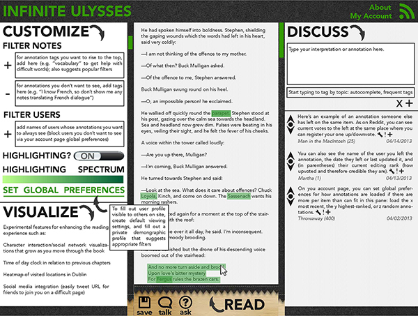
In the spirit of documenting an involving project, here's a quick and blurry glance at my very first wireframe of the site's reading page layout (a higher-res, readable wireframe with a walkthrough should follow in the next few weeks). I thought of this as a "kitchen sink wireframe"; that is, the point was not to create the final look of the site or to section off correct dimensions for different features, but merely to represent every feature I wanted to end up in the final design with some mark or symbol (e.g. up- and down-voting buttons). The plan for the final reading page is to have a central reading pane, a right sidebar where annotations can be authored and voted up or down, and a pull-out drawer to the left where readers can fiddle with various settings to customize their reading experience (readers also have the option of setting their default preferences for these features—e.g. that they never want to see annotations defining vocabulary—on their private profile pages).
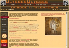
I'm looking forward to finessing this layout with reader feedback toward a reading space that offers just the right balance of the annotations you want handy with a relatively quiet space in which to read the text. This project builds from the HCI research into screen layout I conducted during my master's, which produced an earlier Ulysses digital edition attempt of mine, the 2008/2009 UlyssesUlysses.com:

UlyssesUlysses does some interesting things in terms of customizing the learning experience (choose which category of annotation you want visibly highlighted!) and the reading experience (mouse over difficult words and phrases to see the annotation in the sidebar, instead of reading a text thick with highlightings and footnotes). On the downside of things, it uses the Project Gutenberg e-text of Ulysses, HTML/CSS (no TEI or PHP), and an unpleasant color scheme (orange and brown?). I've learned much about web design, textual encoding, and Ulysses since that project, and it's exciting to be able to document these early steps toward a contextualized reading experience with the confidence that this next iteration will be an improvement.
Possibilities?
Because code modules already exist that allow many of these features within other contexts (e.g. upvoting), I will be able to concentrate my efforts on applying these features to editorial use and assessing user testing of this framework. I'll likely be building with the Modernist Commons editing framework, which will let me use both RDF and TEI to record relationships among contextualizing annotations; there’s an opportunity to filter and customize your reading experience along different trajectories of inquiry, for example by linking clues to the identity of Bloom’s female correspondent throughout the episodes. Once this initial set of features is in place, I’ll be able to move closer to the Ulysses text while users are testing and breaking my site. One of the things I hope to do at this point is some behind-the-scenes TEI conceptual encoding of the Circe episode toward visualizations to help first-time readers of the text deal with shifts between reality and various reality-fueled unrealities.
Practical Usage
Despite this project's speculative design (what if everyone wants to chip in their own annotations to Ulysses?), I'm also building for the reality of a less intense, but still possibly wide usage by scholars, readers, teachers, and book clubs. This dissertation is very much about not just describing, but actually making tools that identify and respond to gaps I see in the field of digital textual studies, so part of this project will be testing it with various types of reader once it’s been built, and then making changes to what I’ve built to serve the unanticipated needs of these users (read more about user testing for DH here). Tomorrow and Thursday, I'll be discussing precedents for the project's use of the edition as an experiment, as well as some caveats and unknowns I'll be facing as I continue this work.
I successfully defended my digital humanities doctoral dissertation in Spring 2015. The Infinite Ulysses social+digital reading platform that was part of that project has been retired into an archival form: a static site with a slideshow tour of past interactive features.