Print Futures! talk
I was an invited speaker for the Partners in Print Print Futures event on 4/26/2026. Here’s an abbreviated version of my talk!
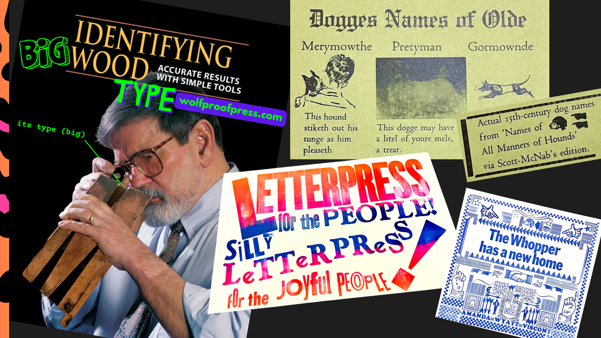
Talk links to my socials & work
- Art Portfolio: WolfproofPress.com
- Letterpress research projects & tools: EnthusiasticType.com
- Transponder Project (queer letterpress blocks): EnthusiasticType.com/transponder
-
Letterpress zines: ZineBakery.com/lp4all
- Me on Bluesky (personal, with more process photos!: @literaturegeek.bsky.social
- Wolfproof Press on Blusky (store updates, new prints, sales etc.): @wolfproofpress.com
-
Me on Instagram: literature__geek (2 underscores)
- Print Day (May 2) opportunity: tinyurl.com/DHprints
- Recent Briar Press thread on lasercutting letterpress
- Scholars’ Lab Makerspace
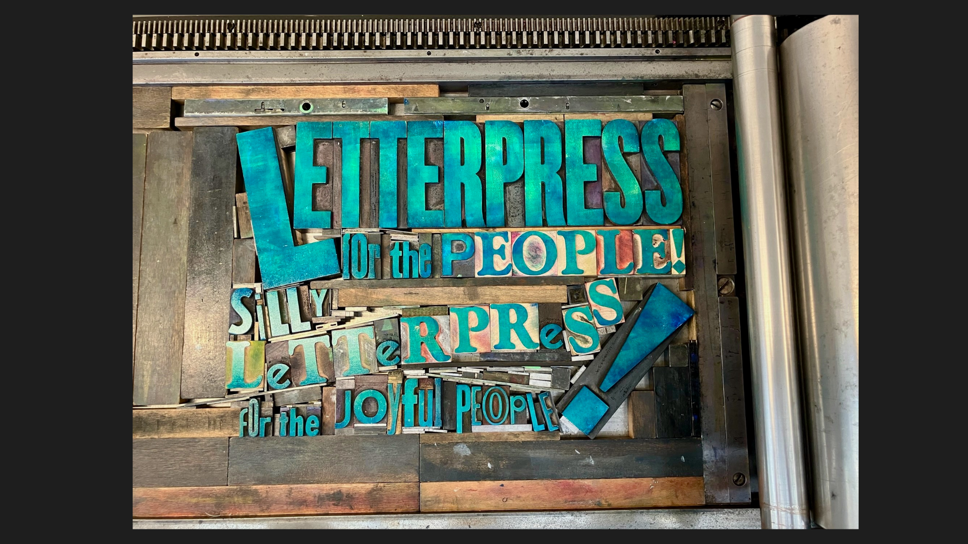
Letterpress for the people! Silly letterpress for the joyful people! (also lasers???)
Hi! I’m Amanda Wyatt Visconti (they/them). I’m a letterpress broadside printer; and I run my own small Wolfproof Press, doing both mutual aid printing fundraising, and selling prints to raise funds for a home press.
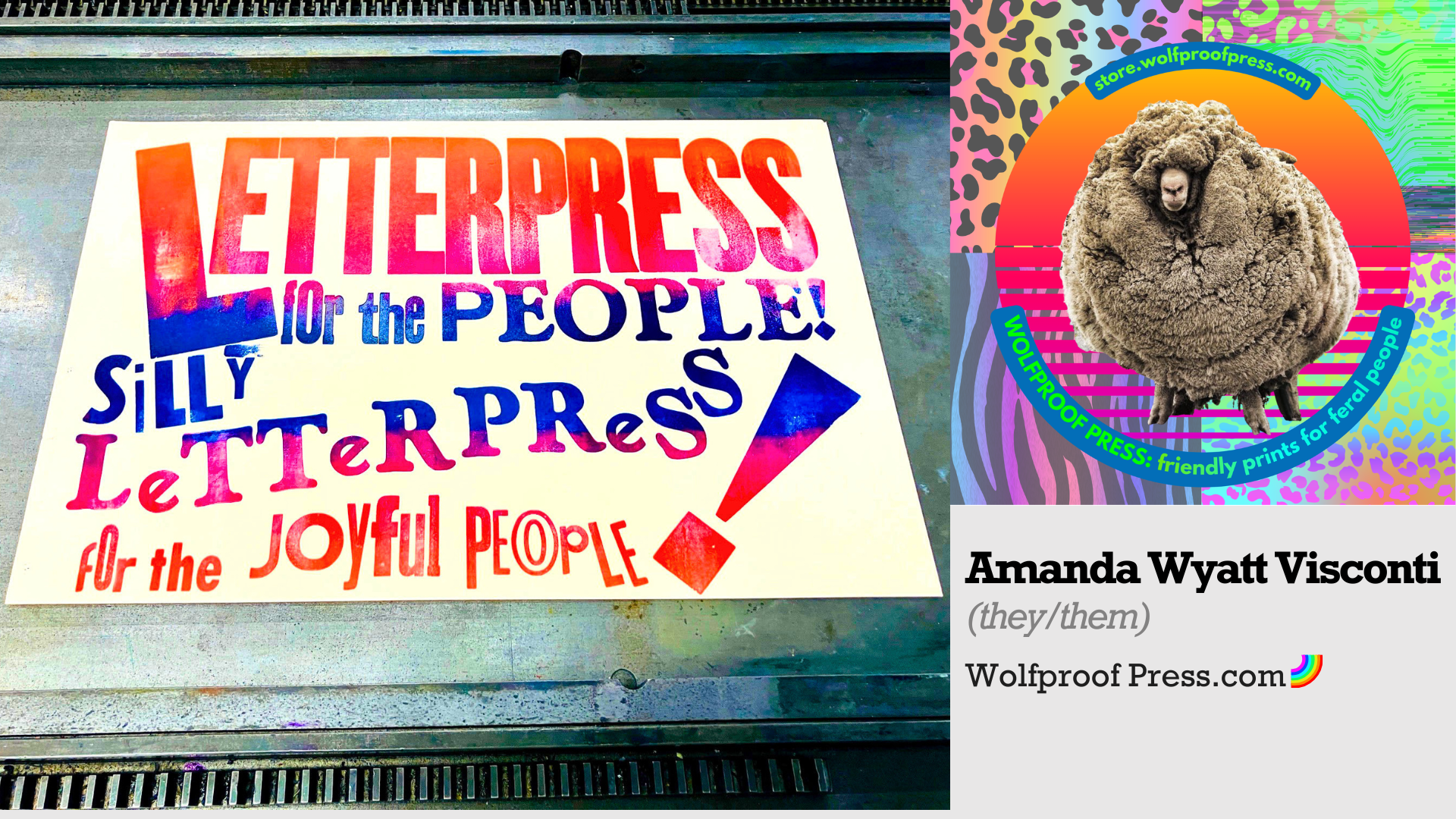
My printing work is fueled by care for social justice, letterpress accessibility, taking joy in experimenting & tinkering, and indulging in the aesthetics I most like to make—lots of bright colors, lots of text, very sincere, silly, joyful.
My day job is directing a digital humanities research and teaching center, the Scholars’ Lab, at the University of Virginia. Today I’m sharing ways my printing practice intersects with the kinds of makerspace , experimental, and digital work found in the digital humanities.
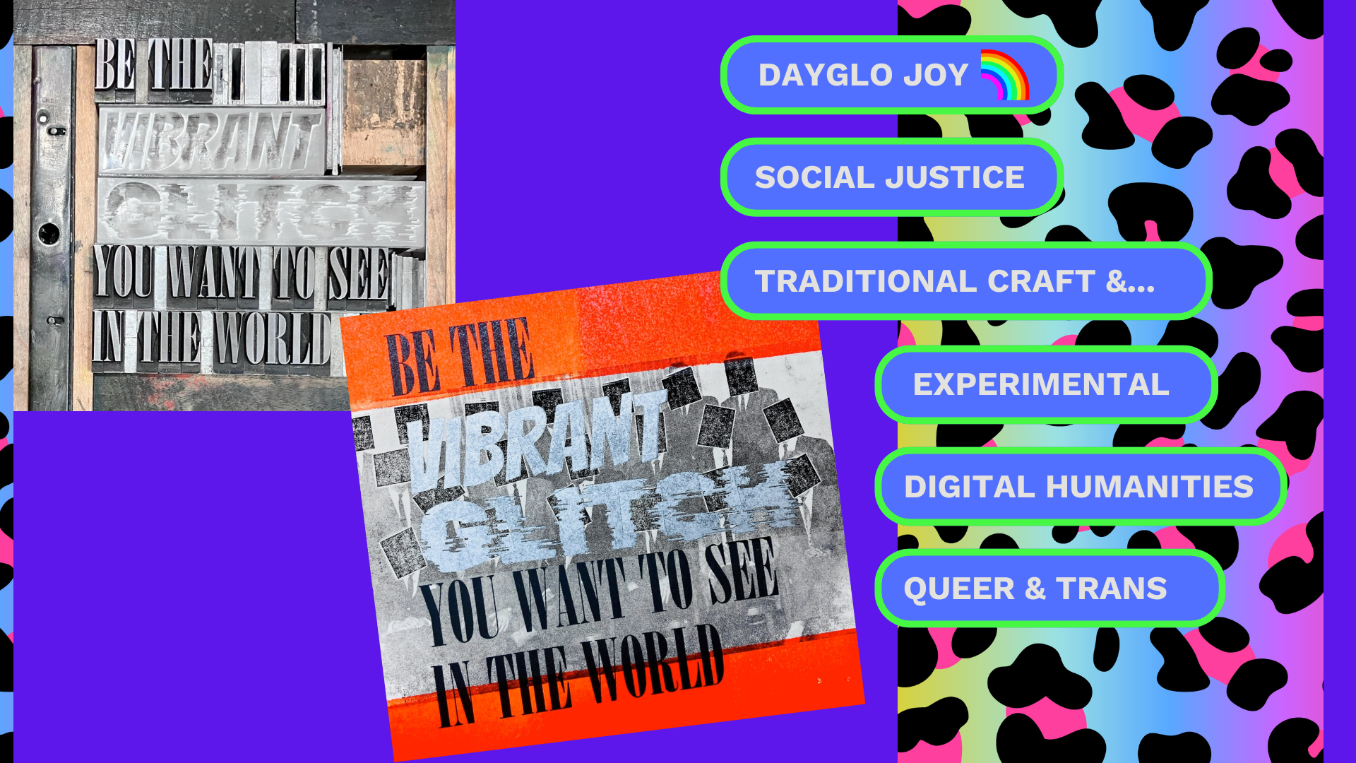
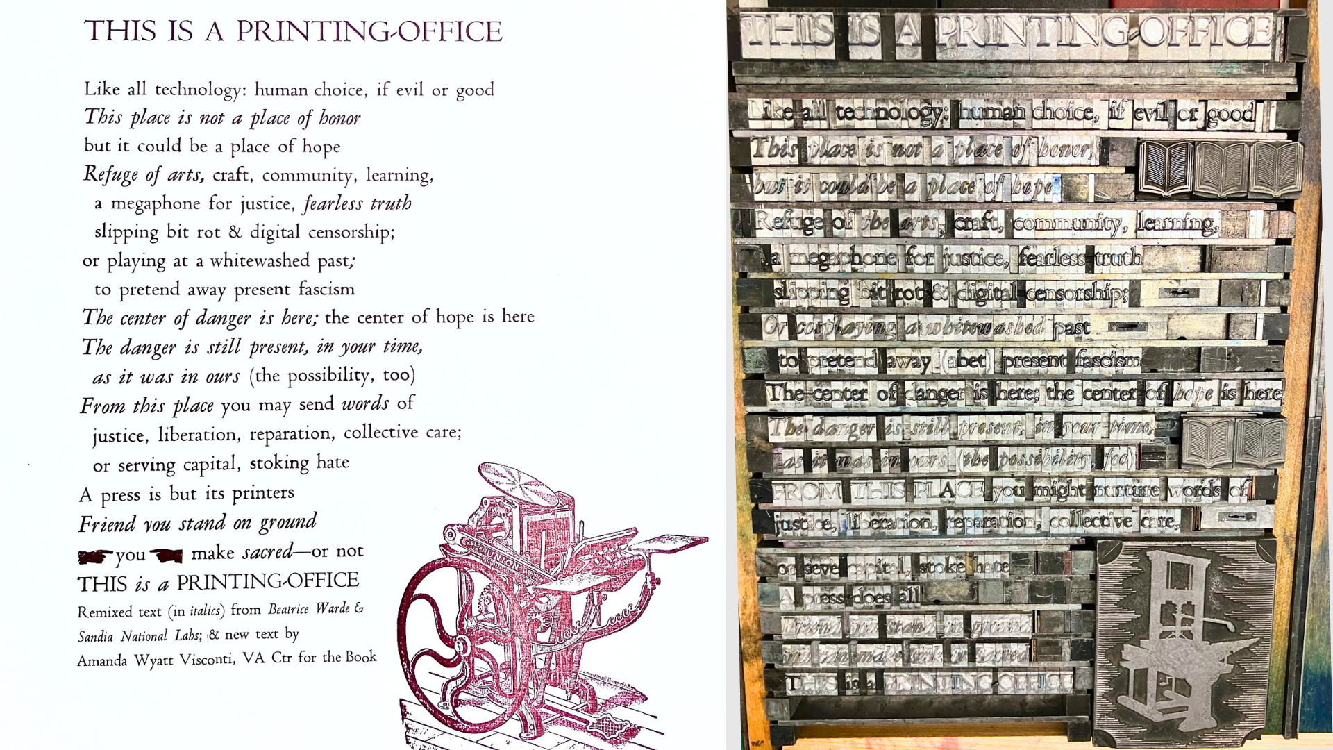
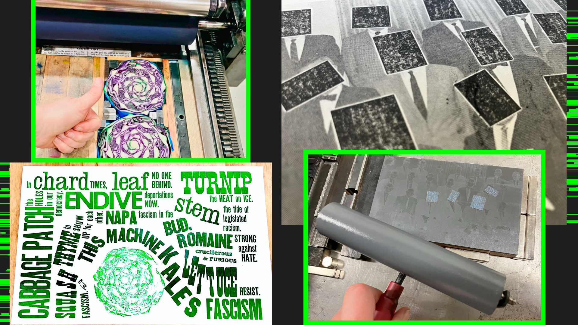
I value & practice non-digital and traditional letterpress craft as well, as with typeset antifascist vegetable puns on the left; or my lead type remix of Warde’s “This is a printing-office” on the left of the slide. I find Warde’s original text a bit too satisfied with anything coming under the head of “printing”— when we know that technologies, digital or not, are only how they’re used and how they impact people.
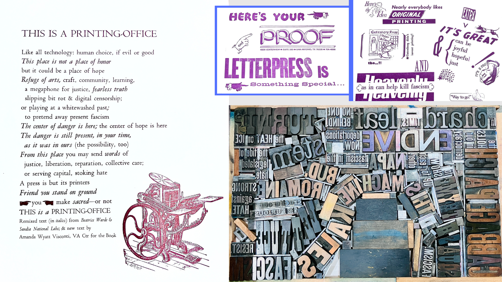
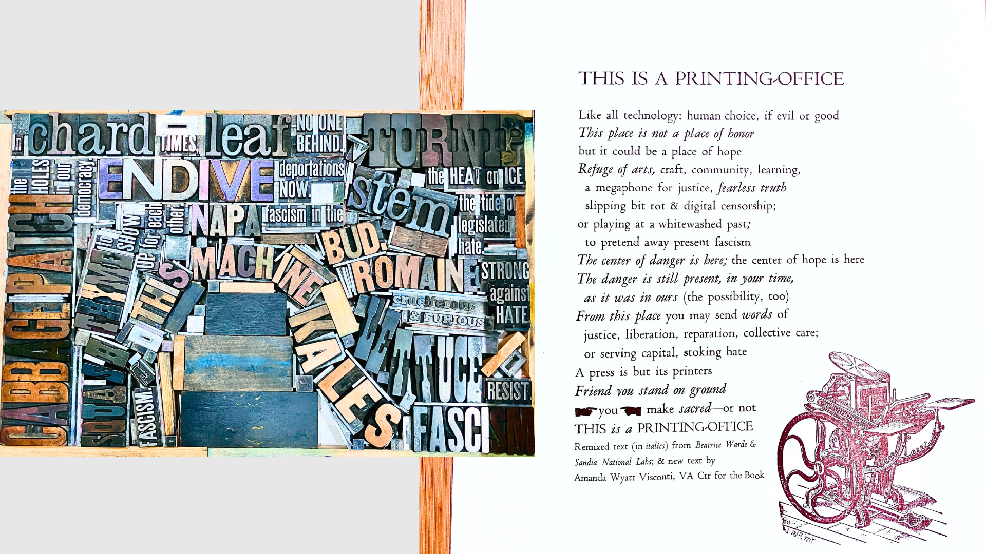
So my remix uses text from a scientific report that tried to craft language that would still be clear in hundreds of years, to warn people concealed nuclear waste sites weren’t buried treasure—you may have heard the line “This is not a place of honor”. And I also wrote my own critical tech text, including: “but it could be a place of hope”.
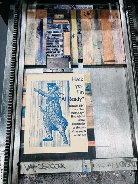
I share this print to say—I don’t want to replace human hands, minds, livings with tech; and I don’t use AI in my practice. Technology is just what we do with it & how it has impacted us, especially those with least power in our current systems.
A long view of technology as simply human-designed solutions, lets us apply centuries of knowledge about ethics, accessibility, design, to what we make, whether that’s digital or not.
And while I’m sharing more digital-ish things today, I’m just as interested in experimenting with non-digital ways of making letterpress art, including:
- printing with type-high red cabbage,
- using painter’s tape to get a cool haloed xerox effect on a halftone printing block,
- playing around with textural modifications to brayers to get neat effects on inked type, and
- reading Paul Moxon’s manual & history of Vandercooks to deeply understand the possibilities & limits of the machine I’m working with
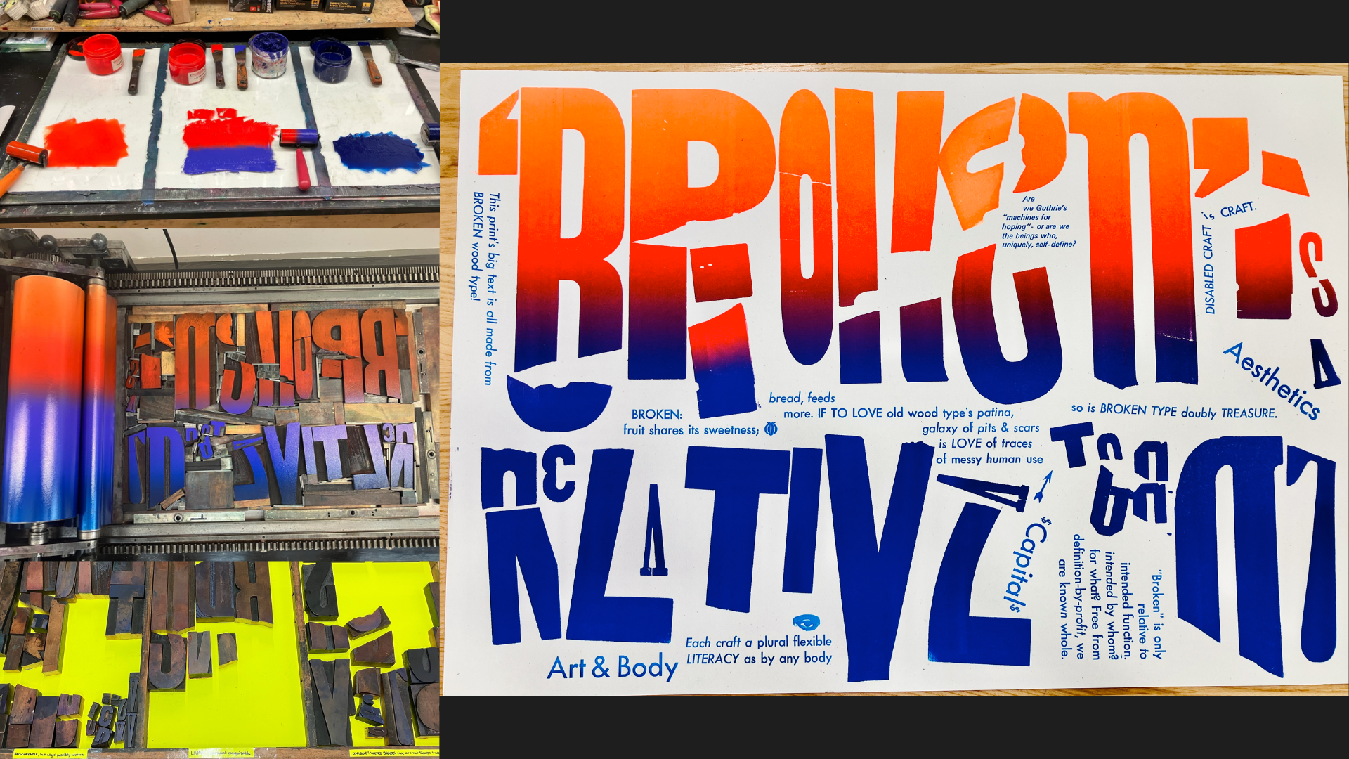
One such non-digital examples is my “Broken is a relative term” print, where the large text is all printed from pieces of broken wood type sorts found at Penland. The smaller text explores human value & identity under capitalism, craft & disability.
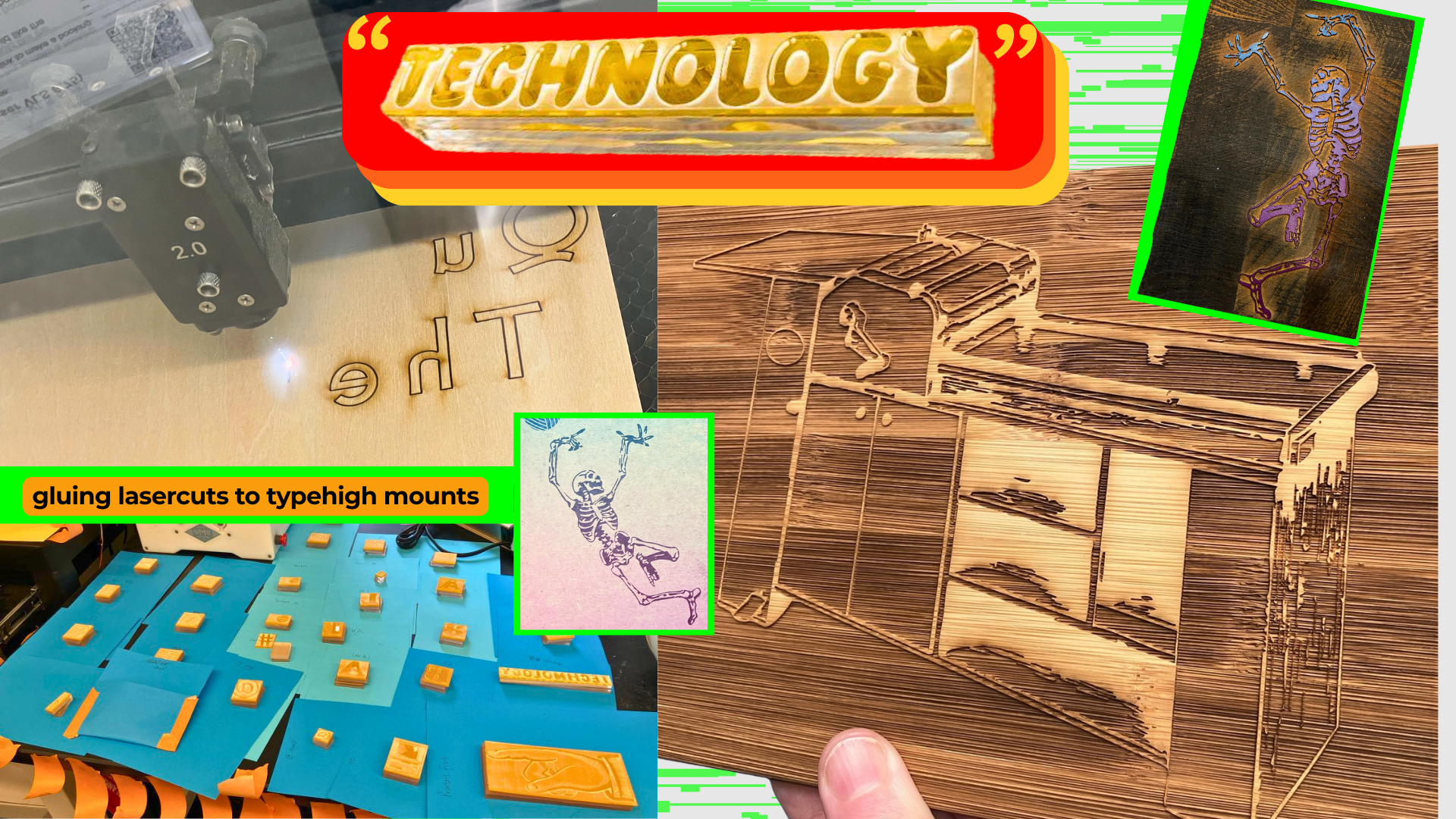
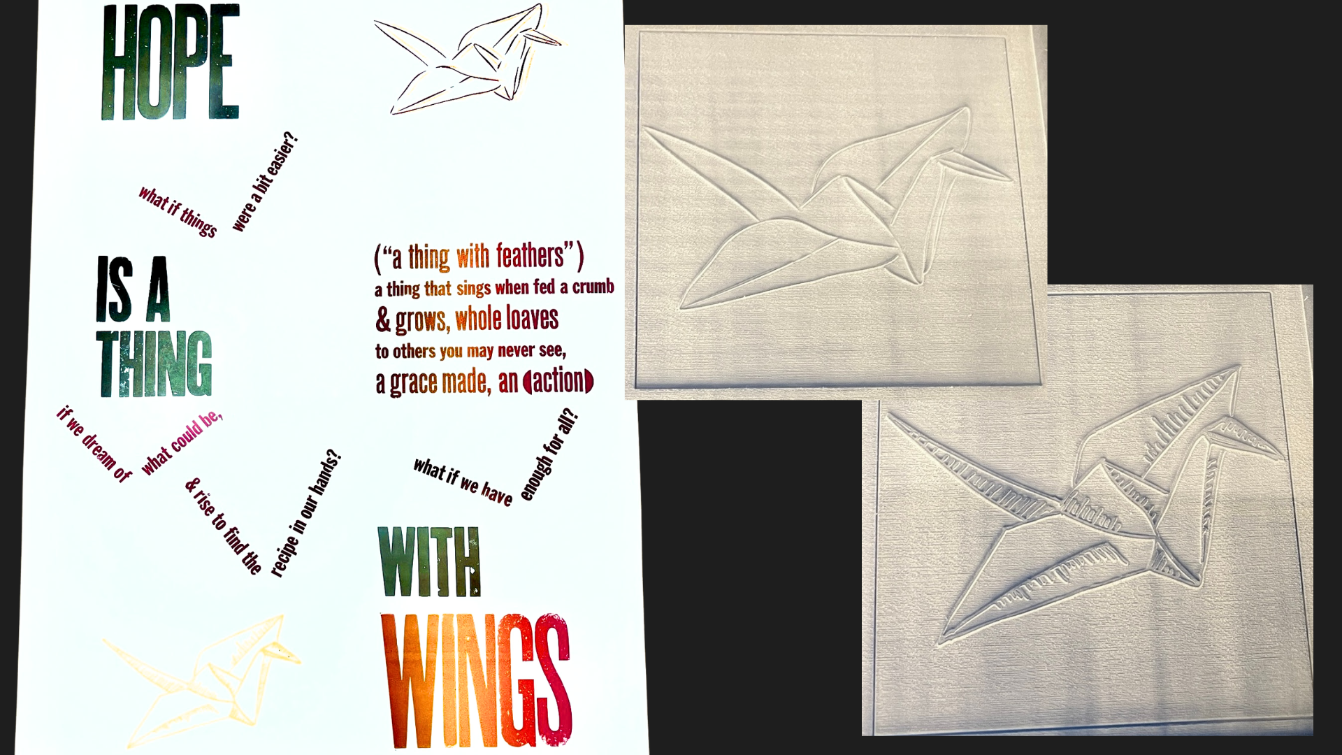
My lasercutting work sometimes means I draw a design by hand, scan it, and digitally edit it for lasercutting. For my “Hope is a thing with wings”: I drew two origami cranes using marker, scanned them, and cut them into acrylic; I was then able to include my simple art in the poster’s many copies.
Sometimes I find historical images from scans of historical newspapers or manuscripts, and digitally edit them to be lasercuttable.
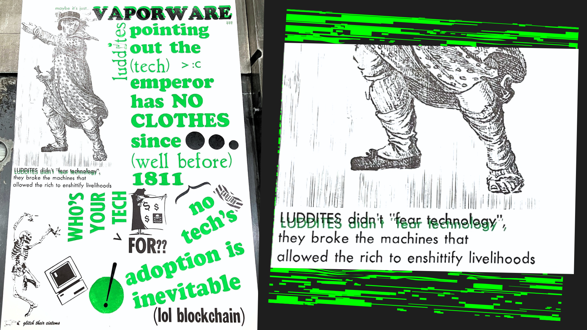
“Vaporware Luddites” channels some Feelings about unethical resource focusing on AI in higher education. It uses blocks I lasercut in bamboo (the large Luddite, from an 1800s newspaper illustration), acrylic (the computer), and hard maple (dancing skeleton, and the “glitch their cistems” block).
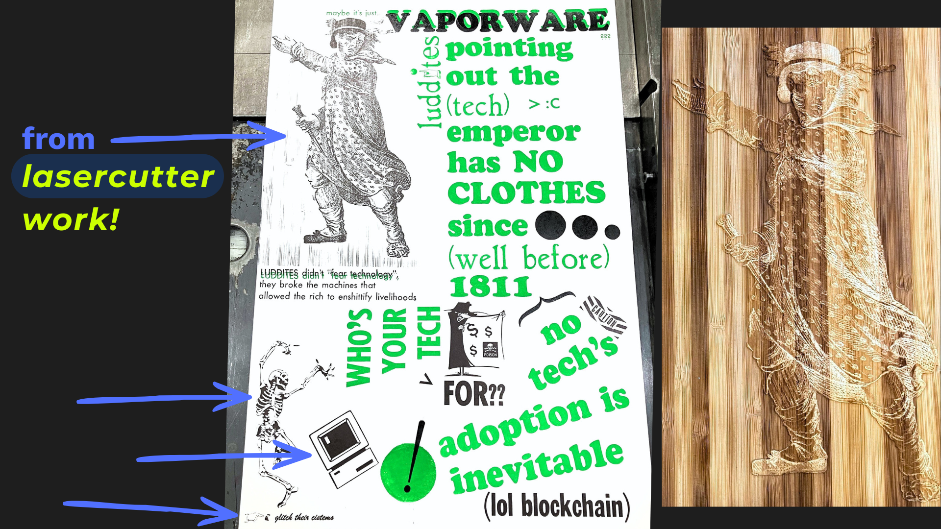
I decided to only mask out bits of the bamboo grain rom the Luddite block that conflicted with text readability, as I thought it looked cool.
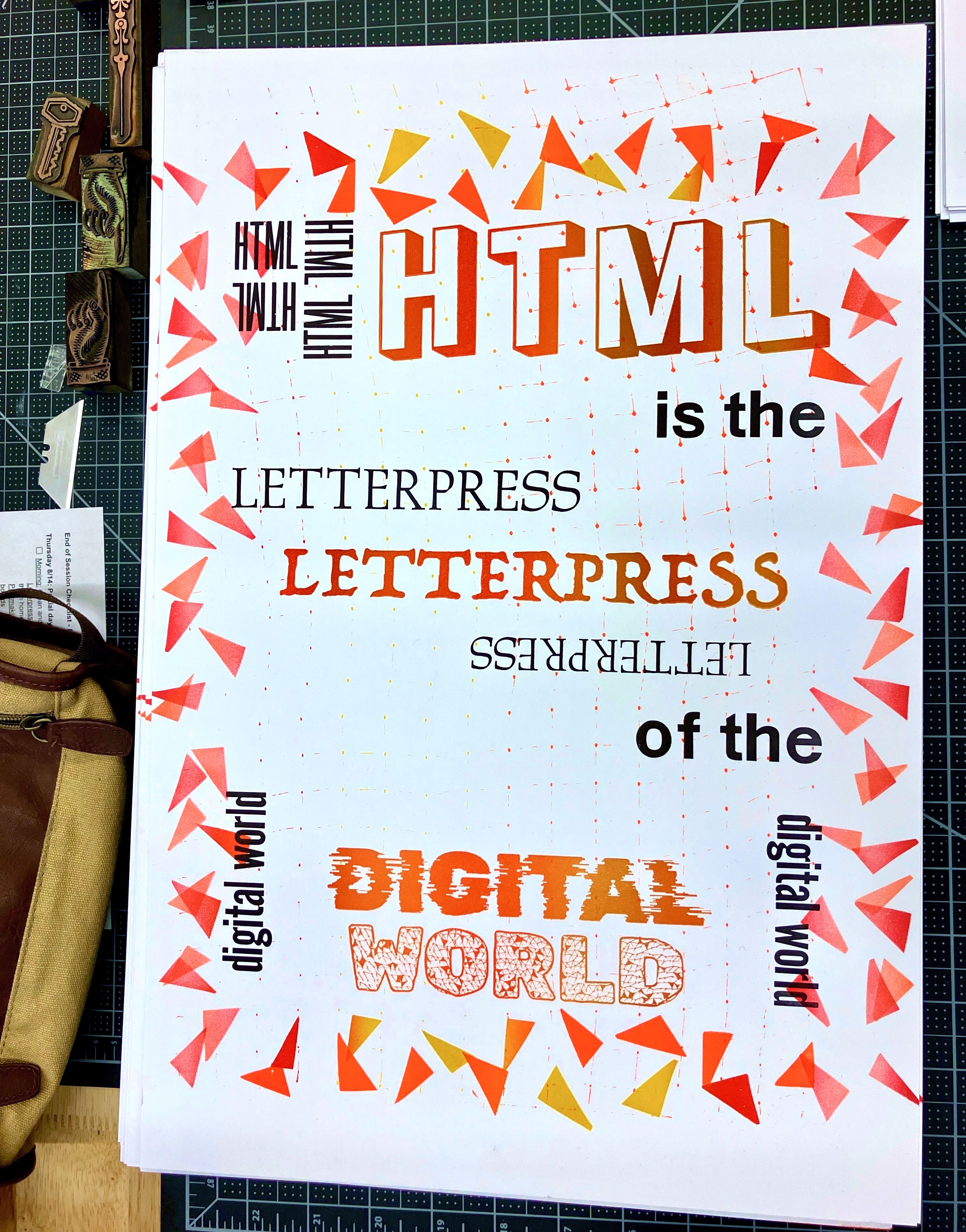
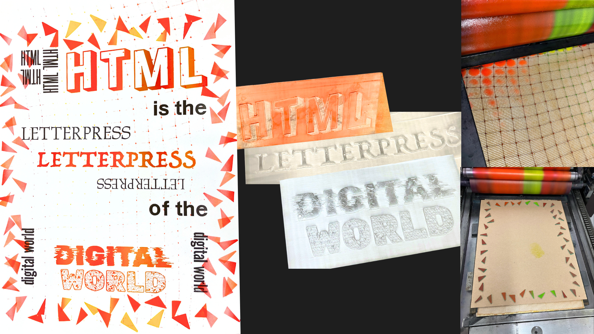
Sometimes I lasercut existing fonts into catchwords or movable type. “HTML is the letterpress of the digital world” (sold out!) uses lasercut keywords for special glitchy fonts, as well as lead type, craft foam triangles, and garden anti-bird netting for texture.
Lasercutting has many similarities to photopolymer. I use it because I’ve got the equipment to make things myself when I want them and print immediately after, rather than waiting for the mail.
There are 3 main things I love about lasercutting:
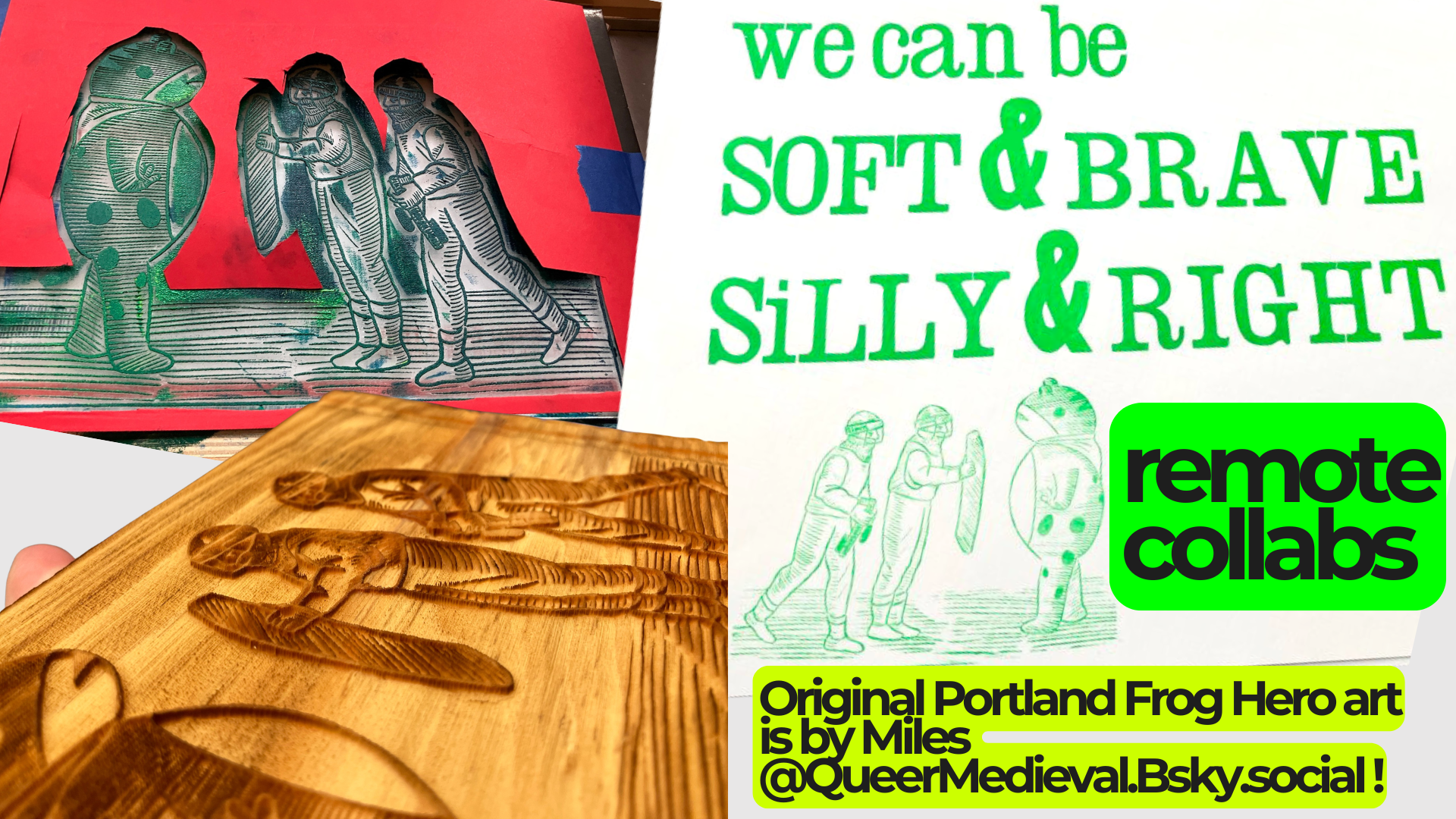
The 1st is that it supports remote collaborations, like the printing blocks I made from art shared on Bluesky for reuse by the artist Miles, which let me print letterpress posters using Miles’ / @QueerMedieval.Bsky.social art of the Portland Frog Hero.
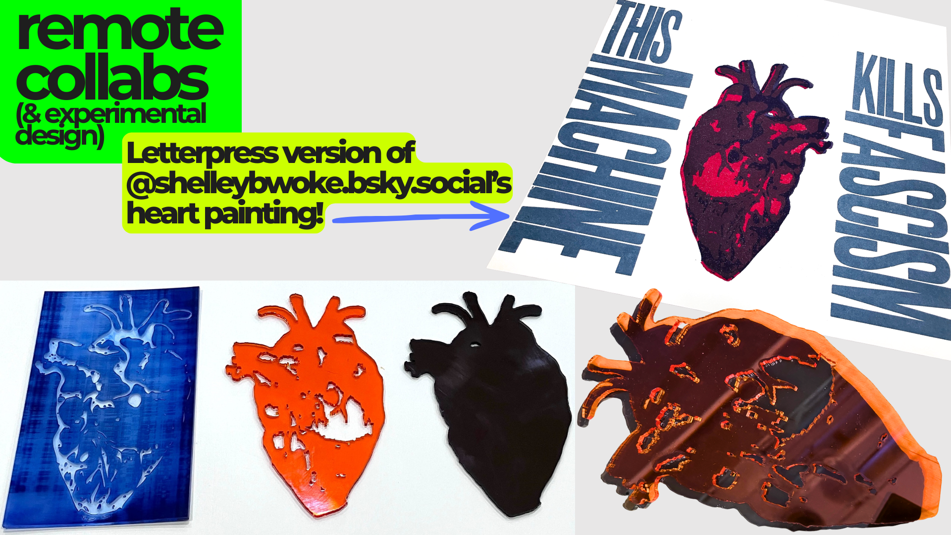
Lasercutting also let me collaborate on a cross-country request to make a letterpress-friendly version of another artist’s painting of an anatomical heart (@shelleybwoke.bsky.social’s heart painting). I digitally split the painting into different areas by tone and shape, and cut those as three printing-block layers. You can see the effect when they’re printed on top of one another, in the upper- right corner.
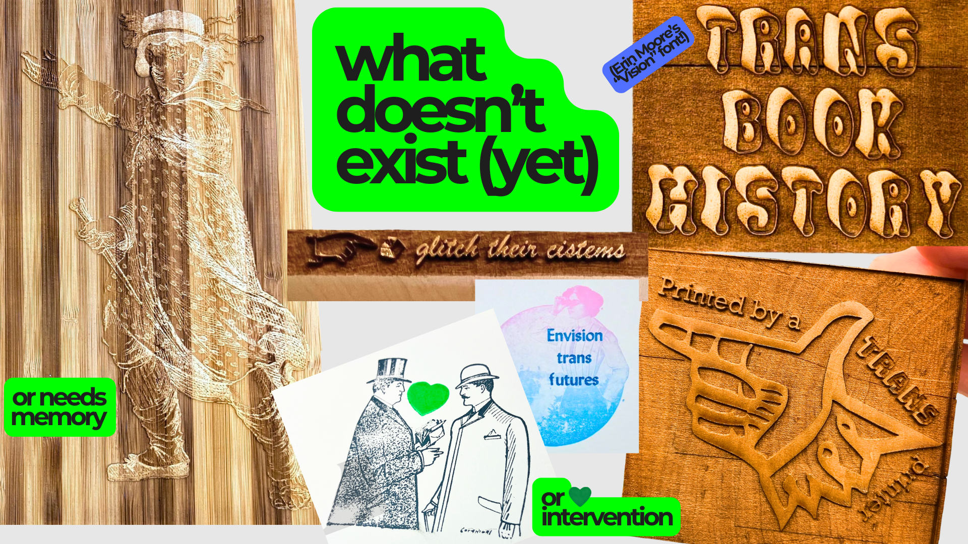
As a trans artist and humanist, I also value lasercutting helping me create what doesn’t exist yet, or needs memory or intervention. Editing a historical image of a beckoning Luddite led to my reading about his use of a gown, & about historical trans relationships with tech & labor.
While I do collect queer & arguably queer historical letterpress cuts & share them via my Transponder Project site, I also explore remixing existing old cuts to queer them, as with the simple green heart addition to these two conversing gents at the bottom of the slide. (“Vision” font is designed by Erin Moore!, I used it on the “trans book history” block pictured.)
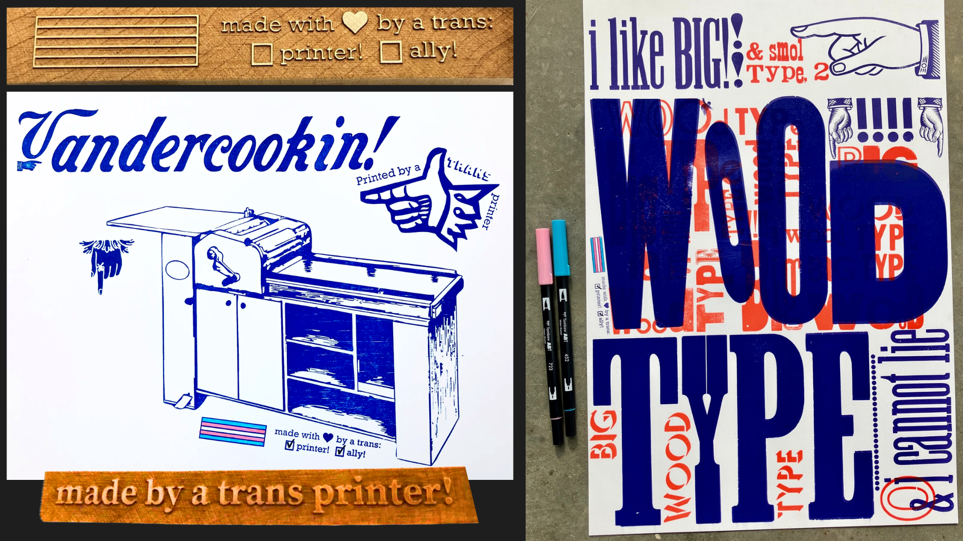
Here’s a print using some of the lasercut blocks from the last slide.
Both prints on screen use my color-it-in block to make trans letterpress practitioners a bit more visible.
Lasercutting also lets me address an access and bias issue: it is harder to find type in non- Latin scripts or with diacritics from where I am (in the U.S.). I’ve been reading about the many amazing folks doing multilingual digital font & physical type design and making, as well as historical work around the world.
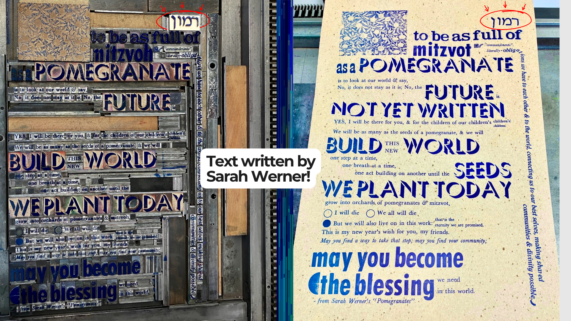
Here’s an example catchword in Hebrew of the word “pomegranate” I made…
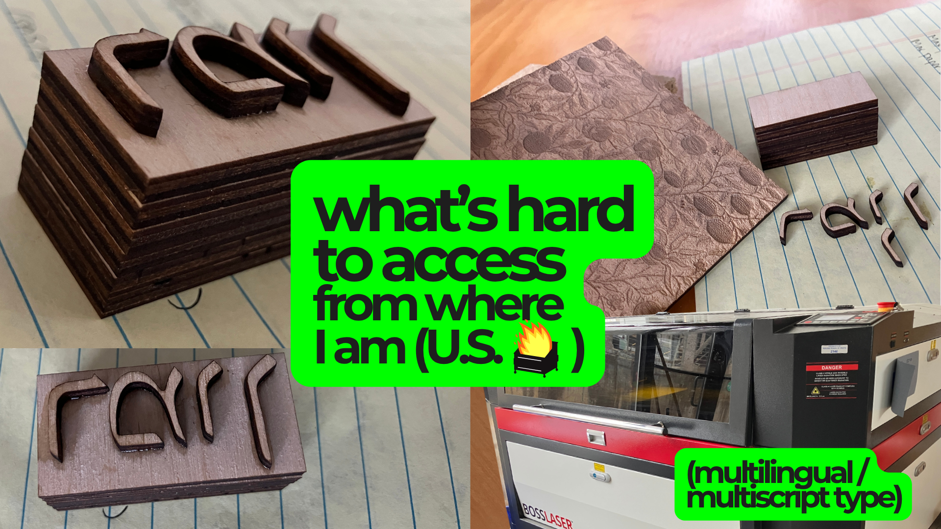
And the print it was part of: you can see it in the upper-right of each photo.
(The lovely text in this print was written by Sarah Werner, as the conclusion of her zine Pomegranates!)
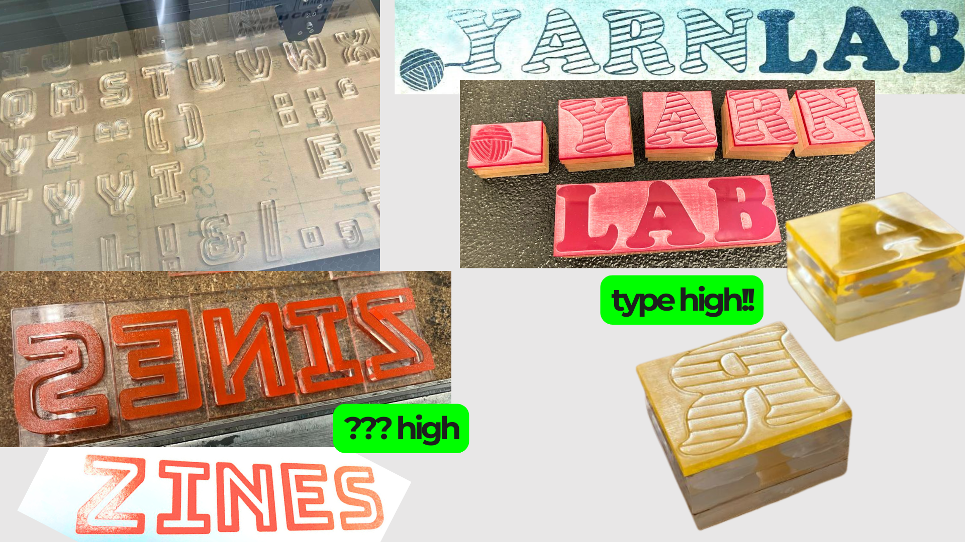
I’ve been practicing lasercutting movable type that’s mounted to type high, in a variety of materials. I’m hoping to eventually do more type design of my own. I also hope to collaborate with writers of various languages beyond the one I’m limited to, to make type for & print in more languages.
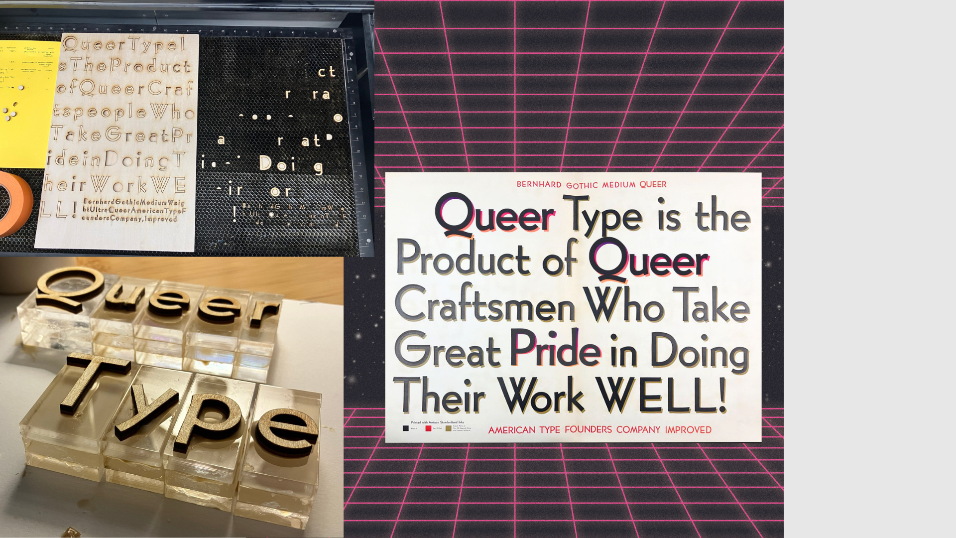
Lasercutting type also lets me intervene in printing history—the “Queer Type” on the left is part of making enough large Bernhard to print a queerly-remixed version of an old ATF (American Type Founders) ad, which I’ve digitally mocked up on the right.
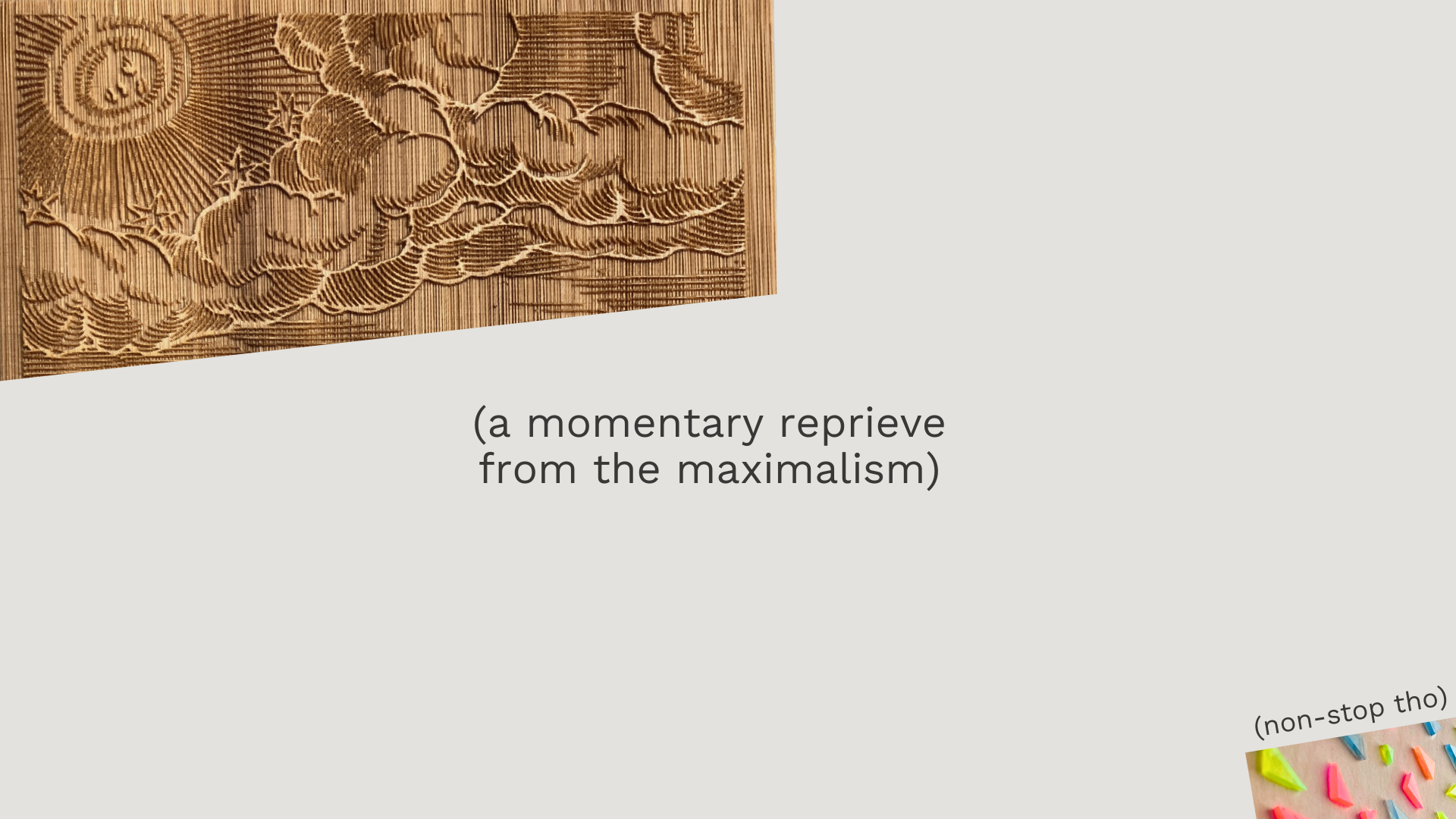
(here is a momentary reprieve from the maximalism & technicolor)
I’ll end with some ways I try to contribute to letterpress being more accessible to all.
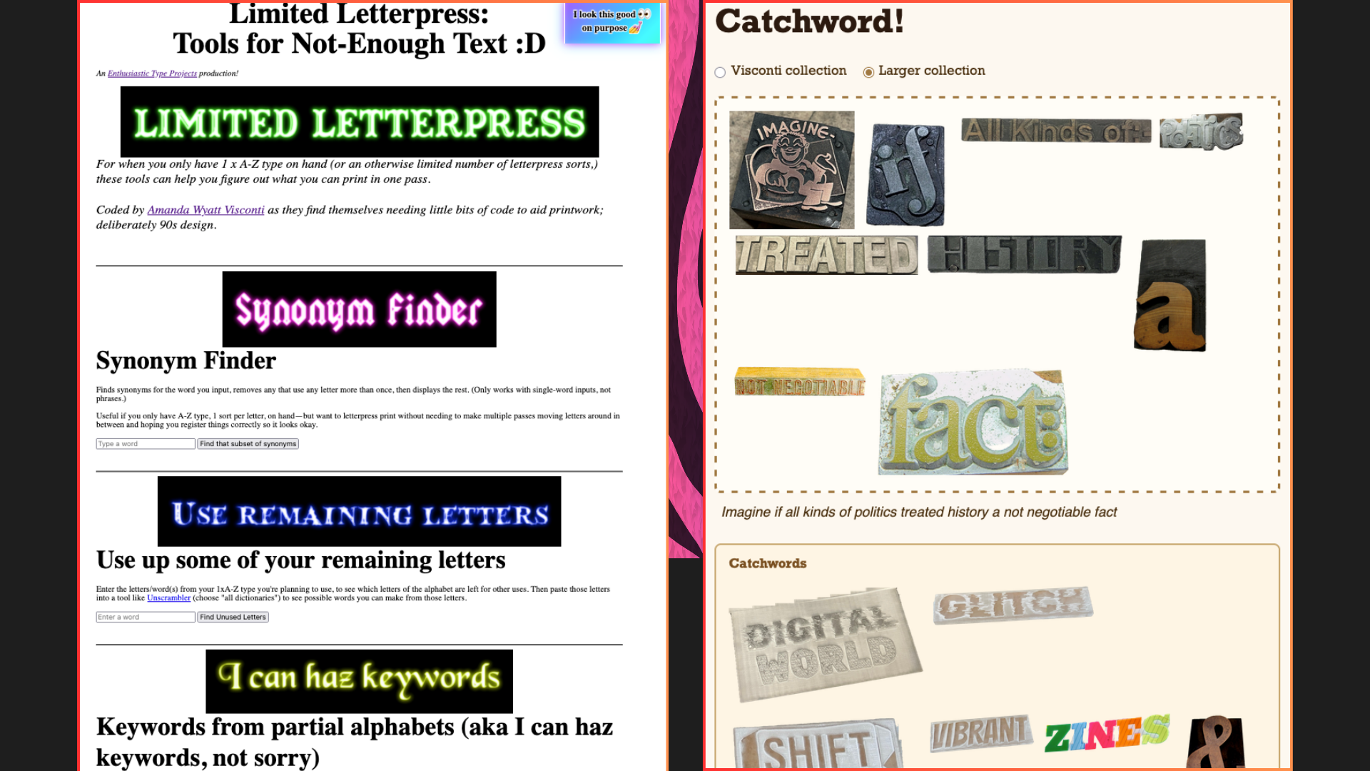
EnthusiasticType.com is my site gathering a variety of free zines I’ve authored; research projects on historical printing, queer cuts, multilingual type, and broken wood type; and tiny webtools I’ve coded, supporting letterpress work with scant type.
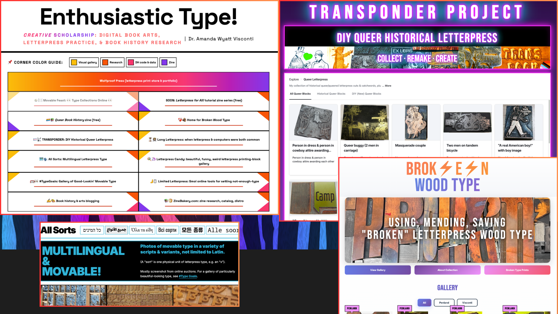
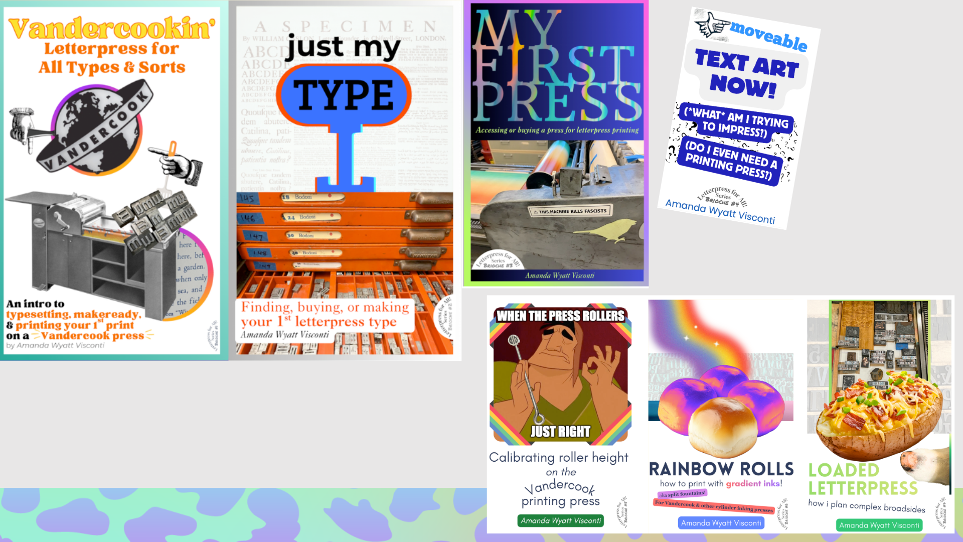
I run a zine distro & also make zines (ZineBakery.com), including a new series that opens with 148 pages introducing typesetting and Vandercook Uni printing, and acquiring your first type and press, all focused on welcome, and physical and financial accessibility.
Those aren’t online yet as they were peer-reviewed and await a journal issue’s publication this summer, but they will be free to read and print as soon as the issue goes live.
I regularly print & hand out free anti-ICE and anti-fascist posters, and contribute print proceeds to mutual aid efforts—because letterpress can’t be for everyone in a world where so many are living precariously.

I try to combine regular advocacy work with joy.
I like to think that a press could make you brave & a better community member.
And I do believe that working for letterpress for all, AND silly & joyful letterpress, are two great tastes that go well together.
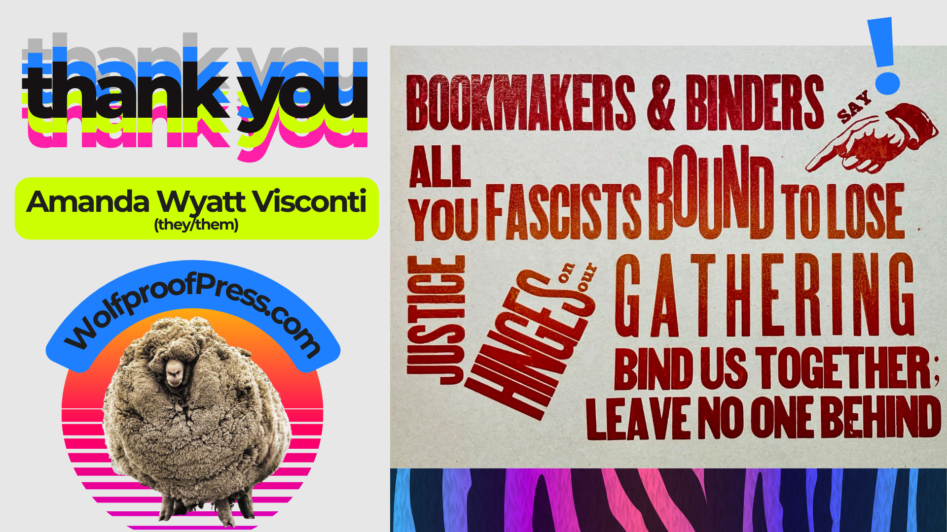
Thank you all, and especially thanks to Partners in Print for inviting me and providing helpful talk feedback! Thanks also to my amazing letterpress mentor, Garrett Queen, and to Ammon Shepherd and Adam Leestma for teaching me useful lasercutting things.