Get Your Data into Gephi: A Quick and Basic Tutorial
If you're interested in learning more about information visualization by trying out some yourself, here's a quick tutorial on how to get a very basic dataset showing character relationships from a piece of literature into Gephi!
You might also check out my posts on the Bloomsday Ulysses visualization project (this year's more in-depth analysis, last year's smaller project), Gephi tutorials (how I used Gephi for my "View DHQ" DH knowledge networks project, Gephi terminology and ideas for exploration), and ACH Microgrant visualization work.
Basic Gephi Dataset Creation
In the Bloomsday project, we recorded data about what character interacted with which other characters, and used a scale of 1-7 to indicate the perceived intimacy of those interactions (e.g. from one person thinking of another person, to an involved conversation between two people).
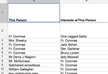
For this kind of network of pairs of interacting people, the most basic relationship dataset would look like two columns on a spreadsheet, with each row containing names of two people in a relationship pair (e.g. John thought about Jim, Washington talked to Jefferson). If you're showing an equal relationship (John and Jim are paired because they had a conversation), the order of who gets placed in which of the two columns doesn't matter; if the relationship does have a direction (John sent a letter to Jim), you can think of these two columns as the "source" and "target" (the name at the start of an arrow, and the name an arrow is pointing at, like John -> Jim).
Here's an example of these two columns in the Bloomsday visualization dataset:
To have a slightly more nuanced visualization, you can add a column to "weight" the edge (the connecting line or arrow between two "nodes"; it's like lines and dots--edges and nodes): assign some number that "weights" the kind of relationship the source and target in each row had. For example, maybe you want to rate the impact relationships had on West's work, with a 1 being least impact and a 3 being most. You now can have a spreadsheet that could look like:
Source Target Weight
John Jim 2
John Jane 1
Jane Jim 2
Here's an example of the three columns used in the Bloomsday visualization:
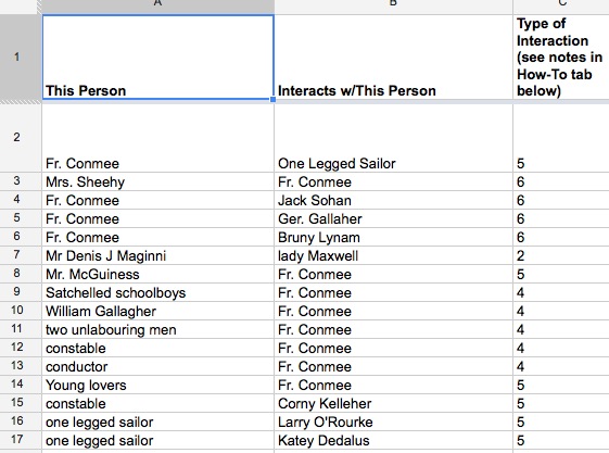
We used the following codes in that dataset (but as I discuss in my post on the resulting visualizations, such coding is highly subjective and definitely be improved/made less ambiguous):
| Coding for "Depth" of Character Interaction | Code to Use in Type of Interaction Column |
| Character thinking of another character | 1 |
| Character observing another character | 2 |
| Omniscient third person narrator (for when two people interact, but it isn't from just one of their viewpoints) | 3 |
| Character acknowledging another character without speaking (tip of the hat, nod, etc.) | 4 |
| Character voicing salutation to another character or other extremely brief interchange | 5 |
| Character entering into conversation with another character | 6 |
| Character having intimate contact with another character | 7 |
If you want to take a closer look at the datasets for the Bloomsday visualizations, I did open viewing of our data recording spreadsheet to the public (and am happy to give anyone who wishes to augment the dataset editing capability). You can also check out the CSVs I imported to Gephi (Wandering Rocks spreadsheet, Start of Book spreadsheet), which have removed everything but the source, target, and weight columns; cleaned up a few errors; and been saved as CSV files.
How Do I Get My Data into Gephi?
Save your spreadsheet as a CSV (in Google Spreadsheet, File > Download As > CSV). Open up Gephi. (If you're on a Mac, you'll probably need to download the 0.8.1beta version of Gephi as of Septmeber 2013, since it doesn't seem to work on OSX--freezes on the data laboratory screen.)
Click on the "start a new project" option in the pop-up screen. Look at the top to see three tabs, with "Data Laboratory" being the middle tab; click on it!
A bit lower and to the left under the tab you just clicked will be an "import spreadsheet" button. Click it and navigate to your CSV file. Under "as table", choose "edges table". Click next.
Make sure weight, label, and create missing nodes are checked, and click finish.
One more step! At the bottom of the page, click on the "copy data to other column" button and choose "ID". In the box that pops up, make sure "label" is chosen and click okay. This will place a label on each node (dot) with the name of the person represented by that dot.
Now, go back to those three tabs at the top of the screen and click on "overview" to play around with the layout of your data, and later on click on the "preview" tab to see how your final visualization will look and download an image file of the visualization.
What Now?
This post has more on what to do once you've got your dataset imported into Gephi, as well as links to other people's less basic Gpehi tutorials. Enjoy!